The new 2024 Paris logo: the story of an impossible graphical consensus
Hairdresser’s shop sign, symbol of the party “Rassemblement National” or even logo of a popular dating application. Since its revelation, the interpretations of the 2024 Paris Olympics logo on social media have been numerous and accompanied of course, by criticisms. Hereafter is a review of a controversy that in our opinion is completely unjustified, albeit expected, considering it surrounds a logo, and moreover one representing the Olympic games.
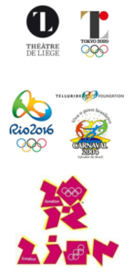
 The latest example of such a controversy is the one involving the organizational committee of the 2020 Tokyo Olympics that was obliged to withdraw its initial logo a few weeks after it was presented, following accusations of plagiarism by the Theatre of Liège.
Similarly, the symbol of the 2016 Rio Olympics had previously generated suspicions of plagiarism of the Telluride foundation’s logo which, as irony would have it, was itself a copy of the one of Salvador city’s 2004 Carnival in Brazil.
In a completely different context, this time political, Iran had also protested against the London Olympics’ organizational committee’s choice of logo by qualifying it as racist over an alleged implicit reference to the word ‘sion.’
However, despite the criticisms and comparisons being circulated these past few days, a majority of French people seem to appreciate the 2024 Olympic Games logo. In fact, in a survey conducted by Opinion Way, more than 80% people confirmed that they liked the design of the logo. The digital agora is thus not always on point in reflecting the opinion of the majority, even far from it.
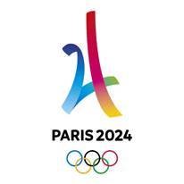
Putting aside individual esthetic preferences, the 2024 Paris logo does successfully meet the challenge of representing at one and the same time the two important symbols of the Olympics and France : on the one hand the Olympic flame and the gold medal representing the identity of the former (though for Pierre de Coubertin the essential was to participate and not to win) and on the other, the face of Marianne illustrating the latter.
 The organizational committee made a deliberate choice of breaking away from the logo of the candidacy which played on the four numbers of ‘2024’ to form an image of the Eiffel Tower with superimposing bright colors. This new identity of the logo translates into a more inclusive approach with a reference to the entire Republic and not just Paris, as well as the face of a woman made up with clean, curving forms. Most importantly, it is to be noted and appreciated that it is the first time that the Olympics and the Paralympics are to share the same logo. The logo fully represents thus the Olympian ideal, one that includes all communities.
The new logo is thus loyal to the organizational committee’s promise: an event that is to embody innovation, sustainability and solidarity.
In our era of universal defiance, this ambition must translate into real actions as much in the preparation of the games as during their holding and then in the management of their legacy. Failing this, these primary, parodical criticisms will only multiply and amplify, attacking not only the appearance but also the essence of the 2024 Paris Olympics.
